I was recently asked to write a guest blog post for Ann E. Grasso, a talented East Coast artist and architect. I had a great time reflecting and writing it and wanted to share this repost with all of you.
Because I take classes online, I meet people from various geographical locations that I would never bump into otherwise. Hannah fits this category. While my usual draw is the visual, in the case of Hannah, it was her words, her thoughts, her care, and concern. Therefore, it is interesting to learn from her writing below that her first solo show was titled Text and Image. Text came first. It is my sincere pleasure to know Hannah through her art as well as her words.
Ann Grasso
And now the page is hers.
Text and Image
Text and Image was the title of my first solo show, many years ago. The title conjures a feeling of magic; the alchemy that occurs when words are combined with images. Those 3 words continue to resonate in my art, years later.

You Know Who You Are @2004, 11” x 14,” Acrylic and colored pencil on paper, private collection
How did I come to add text to image? It’s classic case of nature and nurture.
I went to college in Iowa City, IA, home of the Iowa Writer’s Workshop. Words flew through the air like birds. And my parents were writers; it was natural that text would flow into my work. A bookworm from childhood, I just figured that the best way to approach a piece of paper was as a page of a book.
Gazing Ball, @2004, 11” x 14,” Acrylic and Collage on paper, Collection of University of Iowa Hospitals
Nonetheless, it took many years to figure out how text and image (painted, drawn or printed) interact and how I can use them in my art to create a tight and powerful piece of work.
When I incorporate text, I’m aware that the words exist as hundreds of drawn lines which combine with the lines of paint or drawing to form a composition.
I love to use foreign language books and because I can’t read Japanese or Hebrew (for example) and I lean more on the linear quality of the letter forms.
I also use my intuition when placing text. There are times when someone sees my work at an exhibit and knows the language that I have used.
More often than not, the meaning of the words harmonizes with the spirit of the artwork.
Another issue that arises when incorporating words is whether or not the words need be readable (especially in English). I’ve gone back and forth on this.
There are times in my work when I obscure the words, turn them upside down and make them difficult to discern. I don’t want them to lead the meaning.
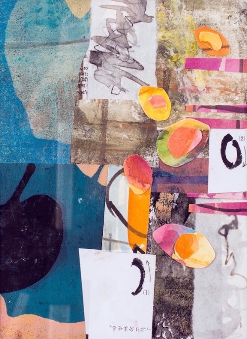
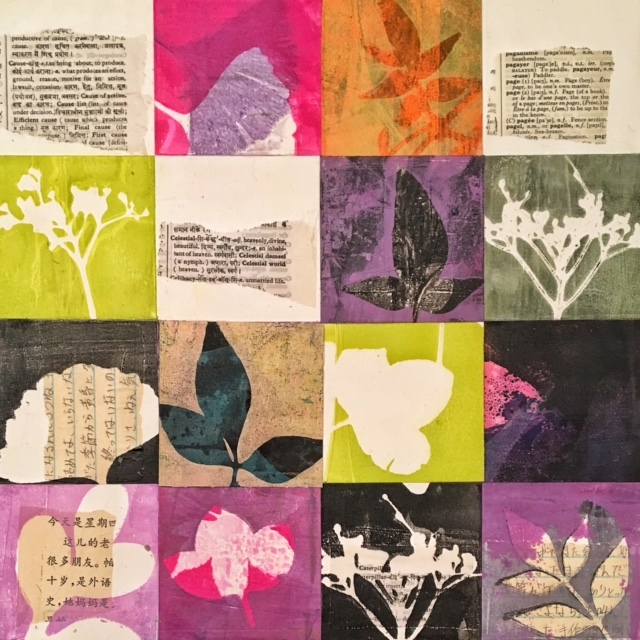
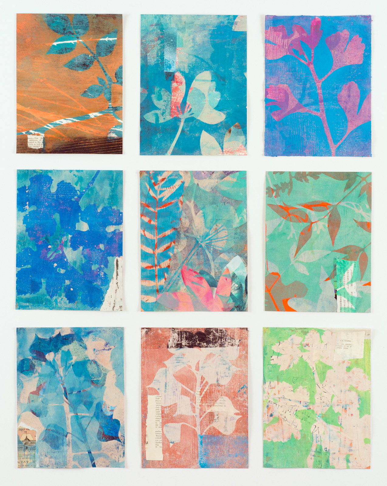
Seeds: New Year, @2017, 7” x 10,” Monoprint collage on paper
In my most recent work though, I’m more open to the words being easy to see and read. I’m using a Hindi-English dictionary as well as another dictionary in French.
I can understand some of the French, and that adds additional shades of meaning to the piece.
And although I can give you reasons why I include words in my work and tell you how I use them, what undergirds it all is a kind of joy. When words come together with color, shape and form, I feel whole and complete.

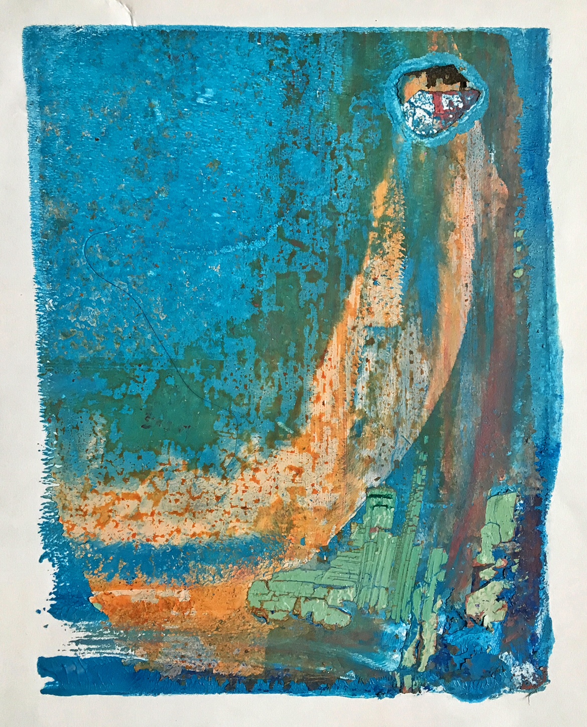
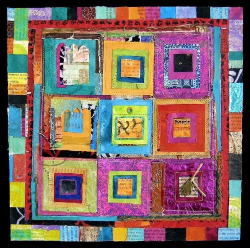
As You Begin, @2017, 12” x 12,” Monoprint collage on panel
How about you? How do you use text in your artwork? I’d love to hear from you.
You can find me at https:hannahklaushunterarts.com, hkhunterarts@gmail.com or on Instagram: @hkhunterarts.
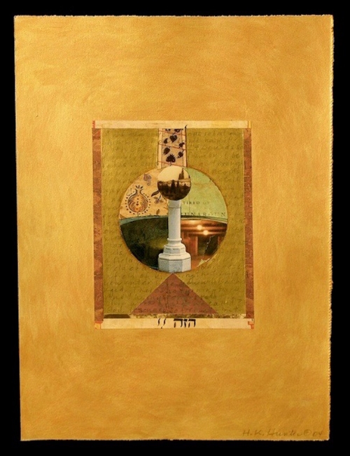
In Spite Of, @2006, 12” x 12,” Collage on panel, private collection