March Artists & Colorful Work

This article was originally published in the Davis Enterprise in March, 2018.

Pence Gallery: March artists bring colorful work

By Natalie Nelson

At the Pence Gallery this March, we are hosting three new solo artists, each who plays with color in a distinctly different way. As we start to plan for our Garden Tour on May 6, color is a fitting subject to center on for the beginning of spring.

Joe Kabriel’s exhibit, “Sense of Time and Place,” is on display from March 2 to 25 in our Andresen Gallery. Kabriel’s landscapes, such as “California Dreaming in Yellow and Gold,” are first drafted in pencil on one of his travels through the Santa Monica Mountains, where he lives and works.

Like many Davis residents, he travels largely on a bike, and his scenic views merge a panoramic perspective with heightened color and texture.

Some of his drawings are printed on aluminum plates, which gives them an iridescent sheen — an appearance that he heightens through digital manipulation of color and pattern into a truly unique landscape.

Hunter_poster.jpg

As he writes, he hopes through his views to “rediscover the wonder of nature seen through a child’s eyes … and to ponder the meaning of life with fresh hope.” Like many landscape artists, Kabriel reflects on how capturing nature can be both a space to “explore the personal conversation between the inner and outer landscapes of the world around us.” Kabriel will be present for the public reception from 6 to 9 p.m. Friday, March 9, at the Pence, so please feel free to stop by to see his amazing view of nature.

Much like Kabriel, Davis artist Hannah Klaus Hunter spent a lot of time in her childhood outdoors, “picking up leaves, studying their shapes and colors, their textures and veins, taking pleasure in small details.”

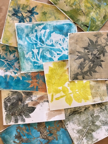
Hunter still loves to collect leaves, which she brings into the studio, to capture the shape, texture and linear qualities of various leaves onto paper. She uses a monoprint process to do this, rolling out a layer of acrylic paint on top of a gelatin-based plate, and then placing leaves on top. After the paper is placed on top, a brayer is used to press the paint onto it.

Some prints are layers of four to five individual print runs, and successful prints are assembled with other versions into an overall larger composition. Sometimes the artist uses natural dyes and pigments to create her prints, which gives her work a natural feel.

To learn her process, plan to attend her Botanical Print & Collage workshop, on Saturday, April 7, from 10 a.m. to 6 p.m. Sign up now at brownpapertickets.com. The cost is $105 ($115 non-members) and includes all supplies. Attendees will also create a small accordion-style book with their prints. Hunter’s exhibit, titled “Paper + Leaf,” is on display through April 13, with an opening on Friday, March 9, from 6 to 9 p.m., sponsored by Far Western Anthropological Research Group.

Another related workshop this month is our Ecoprinting session, from 10 a.m. to 4 p.m. Saturday, March 17. Book artist Dorothy Yuki has taught this workshop on using natural dyes and metals to make prints on cloth and other materials for many Bay Area arts organizations, and after Hunter participated in it, we heard so many great compliments that we had to bring it to Davis. The cost is $165 ($175 nonmembers), and artists can register online through www.brownpapertickets.com.

Last but not least, San Francisco artist Nicole Mueller unveils a new installation as part of her “Light Matter” exhibit, on view through April 13. Mueller’s works are both exuberant and complex, with shifting figure-ground relationships, vibrant color and pockets of deep space, creating pathways that weave in and out of her compositions.

Her large works are painted, cut, collaged, arranged and rearranged, resulting in works that exist between chaos and cohesion.

Mueller is the winner of the Glickman McClure Artist Award for 2018. Given to an emerging artist who produces a new body of work for the Pence, the award is donated by Mark M. Glickman and Lanette M. McClure, and includes a generous stipend.

Mueller is primarily a painter and mixed-media artist, but she is stretching into three-dimensions with an installation of suspended colored Plexiglas shapes. This one piece will be installed in the Bill and Nancy Roe glass tower, visible from our D Street entrance. Not daunted by heights, the artist will be installing at the top of a 20-foot scissor lift soon, securing clusters of wires with the colorful forms on them, so that when light passes through, the hues merge and overlap in truly magical ways.

Mueller’s inspiration was a French chapel with stained glass designed by Henri Matisse, and her installation is sure to have a very spiritual presence. As with any piece that is dependent upon natural light, it will constantly be changing, due to the shifting light conditions.

Her Artist Talk, which describes much of her artistic process and the fabrication of this recent installation, is from 1 to 3 p.m. Saturday, March 24. While the event is free, we are asking visitors to RSVP online, at www.brownpapertickets.com (search Pence Gallery). Mueller will also be present during our public reception on Friday, March 9, from 6 to 9 p.m., so stop by for a glass of wine and to meet the artist.

— Natalie Nelson is executive director and curator of the Pence Gallery; her column is published monthly.

Text and Image

I was recently asked to write a guest blog post for Ann E. Grasso, a talented East Coast artist and architect. I had a great time reflecting and writing it and wanted to share this repost with all of you.

Because I take classes online, I meet people from various geographical locations that I would never bump into otherwise. Hannah fits this category. While my usual draw is the visual, in the case of Hannah, it was her words, her thoughts, her care, and concern. Therefore, it is interesting to learn from her writing below that her first solo show was titled Text and Image. Text came first. It is my sincere pleasure to know Hannah through her art as well as her words.

Ann Grasso

And now the page is hers.

Text and Image

Text and Image was the title of my first solo show, many years ago. The title conjures a feeling of magic; the alchemy that occurs when words are combined with images. Those 3 words continue to resonate in my art, years later.

You Know Who You Are @2004, 11” x 14,” Acrylic and colored pencil on paper, private collection

You Know Who You Are @2004, 11” x 14,” Acrylic and colored pencil on paper, private collection

How did I come to add text to image? It’s classic case of nature and nurture.

I went to college in Iowa City, IA, home of the Iowa Writer’s Workshop. Words flew through the air like birds. And my parents were writers; it was natural that text would flow into my work. A bookworm from childhood, I just figured that the best way to approach a piece of paper was as a page of a book.

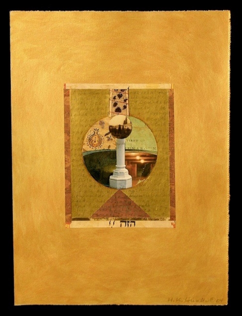
Gazing Ball, @2004, 11” x 14,” Acrylic and Collage on paper, Collection of University of Iowa Hospitals

Gazing Ball, @2004, 11” x 14,” Acrylic and Collage on paper, Collection of University of Iowa Hospitals

Nonetheless, it took many years to figure out how text and image (painted, drawn or printed) interact and how I can use them in my art to create a tight and powerful piece of work.

When I incorporate text, I’m aware that the words exist as hundreds of drawn lines which combine with the lines of paint or drawing to form a composition.

I love to use foreign language books and because I can’t read Japanese or Hebrew (for example) and I lean more on the linear quality of the letter forms.

I also use my intuition when placing text. There are times when someone sees my work at an exhibit and knows the language that I have used.

More often than not, the meaning of the words harmonizes with the spirit of the artwork.

Another issue that arises when incorporating words is whether or not the words need be readable (especially in English). I’ve gone back and forth on this.

There are times in my work when I obscure the words, turn them upside down and make them difficult to discern. I don’t want them to lead the meaning.

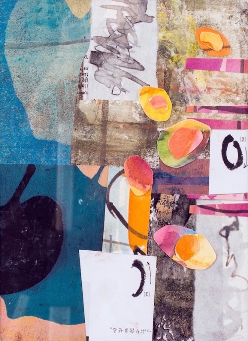
Seeds: New Year, @2017, 7” x 10,” Monoprint collage on paper

Seeds: New Year, @2017, 7” x 10,” Monoprint collage on paper

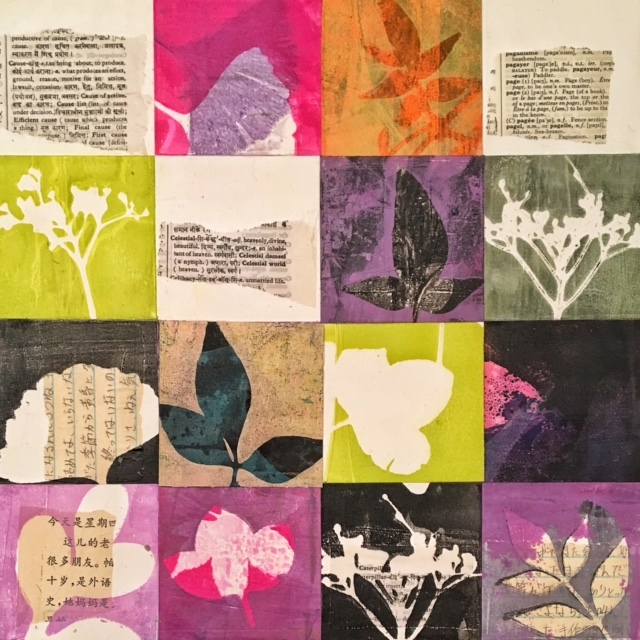
In my most recent work though, I’m more open to the words being easy to see and read. I’m using a Hindi-English dictionary as well as another dictionary in French.

I can understand some of the French, and that adds additional shades of meaning to the piece.

And although I can give you reasons why I include words in my work and tell you how I use them, what undergirds it all is a kind of joy. When words come together with color, shape and form, I feel whole and complete.

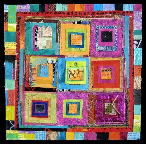
As You Begin, @2017, 12” x 12,” Monoprint collage on panel


As You Begin, @2017, 12” x 12,” Monoprint collage on panel

How about you? How do you use text in your artwork? I’d love to hear from you.

You can find me at https:hannahklaushunterarts.com, hkhunterarts@gmail.com or on Instagram: @hkhunterarts.


In Spite Of, @2006, 12” x 12,” Collage on panel, private collection

Inspiration, Influence and Confluence

Recently I’ve thought about the line between inspiration and influence and when influence can become confluence in art. I wanted to break it down even further so I could understand how these elements operate in my own art making practice.

Last week, I had the chance to explore the thread I call “confluence” following a workshop in botanical contact eco printing.

Examples of botanical eco printing on paper

Examples of botanical eco printing on paper

I love the ethereal effects that I see in eco printing and wanted to see if I could use plant pigments in my own monoprints.

The workshop, led by artist Lotta Helleberg, was challenging and absorbing. Each day we explored the subtle combinations that plants and mordants (fixatives) can create. I tried to keep the various equations in neat columns in my mind’s eye.

My best work came when I threw up my hands and stuck to the basics.

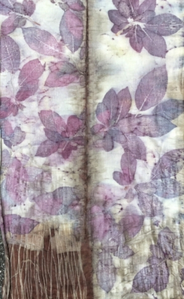
Infinity scarf printed with prunus leaves on silk/wool blend

Infinity scarf printed with prunus leaves on silk/wool blend

The question of inspiration, influence and confluence only truly emerged back in my studio. I work with plant materials, acrylic paints and a gel plate to create botanical monoprints. I wanted to carry over the watery influence of the eco dye baths; the way plants emboss themselves into the paper and leave tangible marks of their presence. I figured this would be easy.

After several printing sessions, I ended up with prints that were neither eco nor mono but a muddle.

Eco prints and monoprints converging

Eco prints and monoprints converging

“What’s going on?” I wondered. “I know how to do this.” I was confused until I received an email from another student. She mentioned how stuck she was following the workshop.

The metaphor of two rivers joining rushed into my mind. When one river joins together with another, it’s called a confluence.

Many things happen when two or three volumes of water with different temperatures, speed and density merge. It’s a messy affair.

The same thing happens when we take part in classes or workshops. The nature of a workshop is immersion; in technique, artwork and the work of other artists. That’s confluence. Once back home, it’s confusing. What’s us? What’s not ours? What marks, patterns or colors looked good but may or may not belong in our work?

Like two rivers converging, it takes time for new material to settle, to allow our unique voice to emerge, hopefully all the stronger for joining with others.

After all, when the Yangtze River absorbs the water from the Jialing, it becomes more powerful and runs for thousands of miles until it meets the South China Sea.

How about you? What’s your experience of confluence in your work?