Text and Image

I was recently asked to write a guest blog post for Ann E. Grasso, a talented East Coast artist and architect. I had a great time reflecting and writing it and wanted to share this repost with all of you.

Because I take classes online, I meet people from various geographical locations that I would never bump into otherwise. Hannah fits this category. While my usual draw is the visual, in the case of Hannah, it was her words, her thoughts, her care, and concern. Therefore, it is interesting to learn from her writing below that her first solo show was titled Text and Image. Text came first. It is my sincere pleasure to know Hannah through her art as well as her words.

Ann Grasso

And now the page is hers.

Text and Image

Text and Image was the title of my first solo show, many years ago. The title conjures a feeling of magic; the alchemy that occurs when words are combined with images. Those 3 words continue to resonate in my art, years later.

You Know Who You Are @2004, 11” x 14,” Acrylic and colored pencil on paper, private collection

You Know Who You Are @2004, 11” x 14,” Acrylic and colored pencil on paper, private collection

How did I come to add text to image? It’s classic case of nature and nurture.

I went to college in Iowa City, IA, home of the Iowa Writer’s Workshop. Words flew through the air like birds. And my parents were writers; it was natural that text would flow into my work. A bookworm from childhood, I just figured that the best way to approach a piece of paper was as a page of a book.

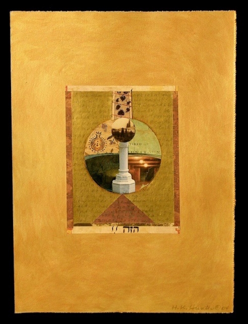
Gazing Ball, @2004, 11” x 14,” Acrylic and Collage on paper, Collection of University of Iowa Hospitals

Gazing Ball, @2004, 11” x 14,” Acrylic and Collage on paper, Collection of University of Iowa Hospitals

Nonetheless, it took many years to figure out how text and image (painted, drawn or printed) interact and how I can use them in my art to create a tight and powerful piece of work.

When I incorporate text, I’m aware that the words exist as hundreds of drawn lines which combine with the lines of paint or drawing to form a composition.

I love to use foreign language books and because I can’t read Japanese or Hebrew (for example) and I lean more on the linear quality of the letter forms.

I also use my intuition when placing text. There are times when someone sees my work at an exhibit and knows the language that I have used.

More often than not, the meaning of the words harmonizes with the spirit of the artwork.

Another issue that arises when incorporating words is whether or not the words need be readable (especially in English). I’ve gone back and forth on this.

There are times in my work when I obscure the words, turn them upside down and make them difficult to discern. I don’t want them to lead the meaning.

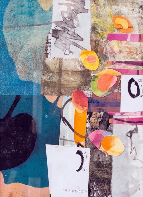
Seeds: New Year, @2017, 7” x 10,” Monoprint collage on paper

Seeds: New Year, @2017, 7” x 10,” Monoprint collage on paper

In my most recent work though, I’m more open to the words being easy to see and read. I’m using a Hindi-English dictionary as well as another dictionary in French.

I can understand some of the French, and that adds additional shades of meaning to the piece.

And although I can give you reasons why I include words in my work and tell you how I use them, what undergirds it all is a kind of joy. When words come together with color, shape and form, I feel whole and complete.

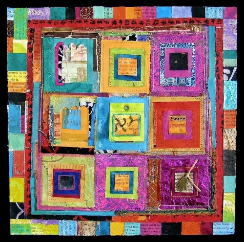
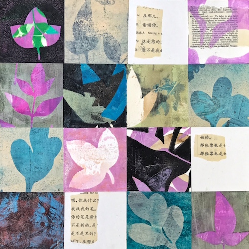
As You Begin, @2017, 12” x 12,” Monoprint collage on panel


As You Begin, @2017, 12” x 12,” Monoprint collage on panel

How about you? How do you use text in your artwork? I’d love to hear from you.

You can find me at https:hannahklaushunterarts.com, hkhunterarts@gmail.com or on Instagram: @hkhunterarts.


In Spite Of, @2006, 12” x 12,” Collage on panel, private collection

Inspiration, Influence and Confluence

Recently I’ve thought about the line between inspiration and influence and when influence can become confluence in art. I wanted to break it down even further so I could understand how these elements operate in my own art making practice.

Last week, I had the chance to explore the thread I call “confluence” following a workshop in botanical contact eco printing.

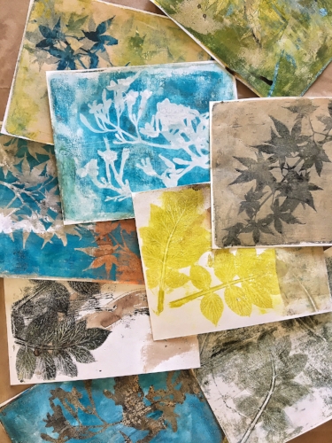
Examples of botanical eco printing on paper

Examples of botanical eco printing on paper

I love the ethereal effects that I see in eco printing and wanted to see if I could use plant pigments in my own monoprints.

The workshop, led by artist Lotta Helleberg, was challenging and absorbing. Each day we explored the subtle combinations that plants and mordants (fixatives) can create. I tried to keep the various equations in neat columns in my mind’s eye.

My best work came when I threw up my hands and stuck to the basics.

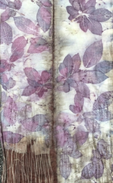
Infinity scarf printed with prunus leaves on silk/wool blend

Infinity scarf printed with prunus leaves on silk/wool blend

The question of inspiration, influence and confluence only truly emerged back in my studio. I work with plant materials, acrylic paints and a gel plate to create botanical monoprints. I wanted to carry over the watery influence of the eco dye baths; the way plants emboss themselves into the paper and leave tangible marks of their presence. I figured this would be easy.

After several printing sessions, I ended up with prints that were neither eco nor mono but a muddle.

Eco prints and monoprints converging

Eco prints and monoprints converging

“What’s going on?” I wondered. “I know how to do this.” I was confused until I received an email from another student. She mentioned how stuck she was following the workshop.

The metaphor of two rivers joining rushed into my mind. When one river joins together with another, it’s called a confluence.

Many things happen when two or three volumes of water with different temperatures, speed and density merge. It’s a messy affair.

The same thing happens when we take part in classes or workshops. The nature of a workshop is immersion; in technique, artwork and the work of other artists. That’s confluence. Once back home, it’s confusing. What’s us? What’s not ours? What marks, patterns or colors looked good but may or may not belong in our work?

Like two rivers converging, it takes time for new material to settle, to allow our unique voice to emerge, hopefully all the stronger for joining with others.

After all, when the Yangtze River absorbs the water from the Jialing, it becomes more powerful and runs for thousands of miles until it meets the South China Sea.

How about you? What’s your experience of confluence in your work?


Spring: Wide Open

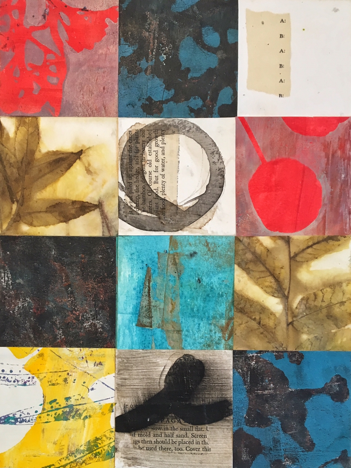
Spring has come again to my corner of the world. Each bush, plant and tree bursts forth in shades of lilac and pale gold so quickly, it stops me in my tracks. The weeks of winter, all the days of waiting give way to wonder.

Seeing Light, 12" x 12," Monoprint Collage with Walnut Ink

Seeing Light, 12" x 12," Monoprint Collage with Walnut Ink

I can't keep up with it! The jasmine over our back gate opens, showering its fragrance on passers by.

The jasmine's abundance is infectious. Up in the studio, my pieced collages grow apace. Tender new leaves tempt me on on my walks. I gather handfuls of leaves and carry them, like gifts, up to the studio.

Last fall, I started a bucket of walnut ink last fall and this week, I called it ready and poured rich, inky liquid into half pint jars, lining them up to admire their contents.

I'm brushing the ink on some of my paper squares before I print and I like the subtle undertones it adds to the work. I'm curious to see how it affects the direction of new prints and I'll share more as they emerge. In the meantime, I wish you much delight as spring unfolds, wherever you are.

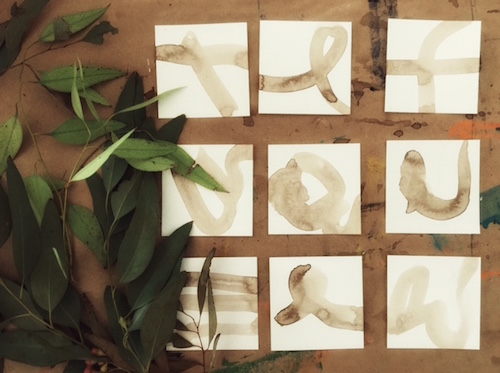
Squares with walnut ink, ready for printing with eucalyptus leaves.

Squares with walnut ink, ready for printing with eucalyptus leaves.